| |
|
Current Temperatures in Degrees
Fahrenheit
|
| Grand Teton Automated Station |
Timbered Island |
Jackson Hole Airport |
Jackson |
Snow King |
Jackson Hole Ski Summit |
Huckleberry Divide |
How to Read the GraphsSome DefinitionsSnow Water Equivalent (SWE): This is the amount of water in the snow. Imagine melting all the snow in a place and seeing how deep that water is. . .that is the snow water equivalent. Snow is mostly air. Ten inches of snow depth might contain only 2 or 3 inches of water and 7 or 8 inches of fluffy air in between the flakes. Since the density (fluffiness) of snow changes a lot as the snow settles, partially-melts, and refreezes, snow depth can change a lot in just a day or two, but the amount of water on the ground will remain relatively constant. When you are comparing the amount of snow in different locations, it is easier to think in terms of SWE than depth because you don't need to worry about whether the snow is fluffy in one place or dense and compacted somewhere else. If someone wants to predict how much flooding there will be in the spring, it is important to know how much snow water is going to melt. The snow depth is less important.SNOTEL - An abbreviation for "Snow Telemetry." This is a type of weather station that has been designed to measure snowpack and precipitation, typically at high elevations. The SNOTEL network is run by the Natural Resources Conservation Service. Departure - The amount that a particular month (or other time period) differs from an average. Usually, when a weather report says something like "last month was 2 degrees above average" this is an informal way of saying that the monthly average for that month departed by 2 degrees from the 30-year average for that month. The 30-year average used in the comparison is updated every 10 years. Right now, the standard 30-year averages are calculated from the years 1981 - 2010. Before that, they were calculated from 1971 - 2000. These aren't simple averages, but are instead official values released by the National Weather Service, and they have been corrected for missing data and other biases. For more information on 30-year averages, visit this web page. Tmax: T = Temperature. Max = Maximum. If you see "Tmax" for a particular day, this is the warmest temperature measured for that day. If instead you see "Tmax" for a month, this is the average of all the daily Tmax values measured during the month. In other words, a monthly Tmax is the average of all the warmest temperatures for each day in a month. Tmin: T = Temperature. Min = Minimum. This is very similar to Tmax. Read the paragraph above this one and replace "coolest" everywhere you see "warmest." How do I read a SNOTEL graph like the one below?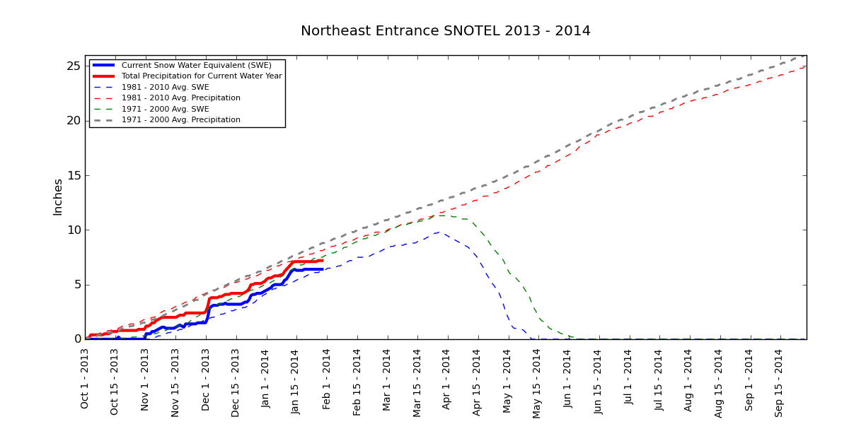 This type of graph is updated every day. You can use it to see how the current year's snow and precipitation compare to an average year in the past. First, notice that the graph goes from October 1 to September 30 of the following year. This is called a "water year" and it is meant to reflect the fact that summers in the mountains are drier than winters and don't have much snow. Snow doesn't really start to accumulate until autumn (around October 1) and then the natural water cycle runs through the winter until the end of the following summer (September 30). So at the start of every water year (October 1), the amount of snow and the amount of precipitation for that "year" is reset to zero. The graph, then, shows the total of amount of snow (blue solid line) and precipitation (red solid line, either snow or rain) that has fallen since the start of that water year. Snow is measured as SWE (see definition above) on the ground during each day, so if snow melts, the amount of SWE will decrease. Precipitation, in contrast, is a simple running total of all the water that has fallen during that water year. The dotted lines show the average amount of snow and precipitation that had accumulated by each date during the reference periods 1971 - 2000 and 1981 - 2010. In the example graph above, you can see that the total amount of snow snow on January 20, 2014 was slightly above the 1981 - 2010 average (blue dotted line) for that day and slightly below the 1971 - 2000 average. (green dotted line). You can also see that during 1981 - 2010 (blue dashed line), the peak (greatest amount) of snow was reached sometime around April 1 (on average) and that it completely melted out sometime around May 15 on average. How do I read a Departure Graph ?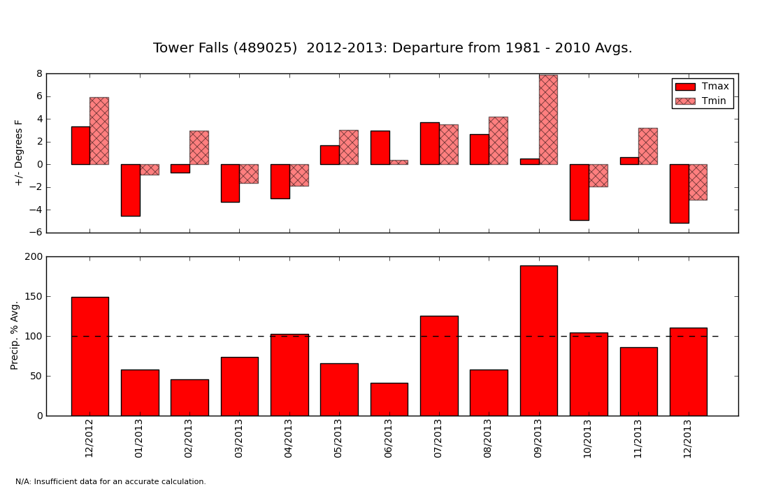 These graphs are a bit like the weather report that tells you whether each month was above or below "average." The top half of the graph shows whether each month was warmer or cooler than the 30-year average (see definition of 30-year average above). If a bar goes above zero, the month was warmer than average. If it goes below zero, it was cooler than average. In the example above, you can see that February 2013 had Average Daily Maximum Temperatures (Tmax - see definition above) about 1 degree below average and Average Daily Minimum Temperature (Tmin -- see definition above) about 4 degrees above average. In others, February had daytime high temperatures that were unusually warm and night-time lows that were slightly below average. The bottom half of the graph shows how the precipitation during each month compared to average. If a bar extends above the 100% mark (dashed line), then the month was wetter than average. If a bar falls below the dashed line, it was drier than average. Importantly, this graph will not tell you how warm it was or how much precipitation actually fell. It only tells you how much the temperature and precipitation were above or below the average. |